Customizing the block — layout and style options
This guide describes the options available in the Featured Ingredients theme block (Feature It app block) when you customize your product template in the Shopify theme editor.
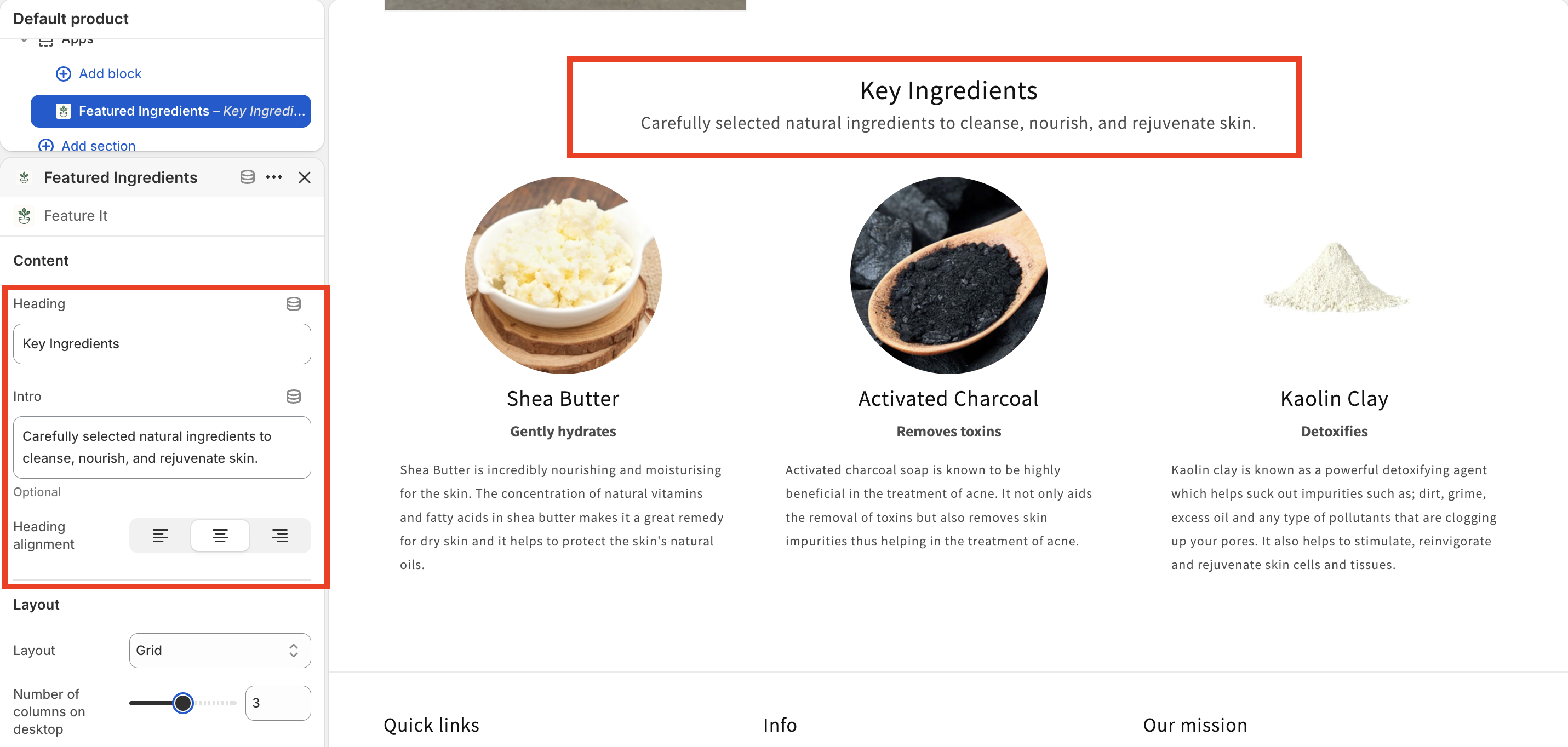
The block shows ingredient content you manage in the Feature It app. Settings below only control how that content is presented on the storefront.
Content
| Setting | What it does |
|---|---|
| Heading | Section title shown above the ingredients (default: “Key Ingredients”). |
| Intro | Optional short text under the heading. |
| Heading alignment | Aligns the heading (and intro) to the left, center, or right. |
Layout
Choose how ingredients are arranged on the page.
Layout type
| Option | Best for |
|---|---|
| Grid | A balanced gallery of cards; columns follow your desktop column setting, then adapt on smaller screens. |
| Carousel | Horizontal scrolling when you have many items or limited horizontal space. |
| List | A vertical stack with a controlled maximum width—good for readable, article-like flows. |
| Accordion | Expand/collapse rows; keeps the page compact while still allowing full detail per ingredient. |
Options that depend on layout
Grid or Carousel
- Number of columns on desktop — How many ingredient cards appear in one row on large screens (1–5). On smaller breakpoints, the theme uses fewer columns automatically (typically two on tablet, one on mobile).
List only
- Max width for list layout — Caps how wide the list can grow (320–1200 px), so long lines of text stay comfortable to read.
Accordion only
- Only allow one ingredient open at a time — When enabled, opening one panel closes the others.
Carousel only
- Show arrows — Turn navigation arrows on or off.
- Arrow position (when arrows are on) — Inside the carousel, Outside the edges, or Below the slides.
- Pagination dots — Show or hide dot indicators for the current slide.
All layouts
- Spacing above and below — Vertical padding for the whole section (0–100 px).
Style
These settings control cards and overall spacing.
| Setting | What it does |
|---|---|
| Card style | Flat — minimal separation. Outlined — border emphasis. Shadow — elevated card look. |
| Card background | White, Transparent, Subtle (light tint using your theme colors), or Custom (pick a color). |
| Custom card background color | Shown when Card background is Custom. |
| Corner radius | Rounds card corners (0–24 px). |
| Gap between items | Space between ingredient cards or rows (0–60 px). |
| Card alignment | Aligns text and content within each card (left, center, or right). |
Image settings
| Setting | What it does |
|---|---|
| Image fit | Contain — the full image is visible inside the frame. Cover — the frame is filled; edges may be cropped. |
| Extend to card width | When Image fit is Cover, optionally stretches the image area to the full card width. Not available for List or Accordion layouts. |
| Image size | Small, Medium, or Large (relative image dimensions in the layout). |
| Image shape | Square, Circle, or Rounded frame around the image. |
Typography
| Setting | What it does |
|---|---|
| Title font size | Small, Medium, or Large for ingredient titles. |
| Subtitle style | Text — subtitle as normal text. Badge — subtitle in a pill-style label. Hidden — no subtitle. |
| Badge style | When subtitle is Badge: Neutral or Accent 1 styling for the pill. |
| Show description | Toggle longer description text per ingredient. |
| Description alignment | Left, center, or right alignment for description text. |
Advanced settings
| Setting | What it does |
|---|---|
| Custom CSS | Optional CSS to fine-tune appearance. See Feature It’s custom CSS documentation for guidance. |
| Product | Which product’s ingredients to display. Usually autofills to the product you’re editing when you open the theme editor from a product page. |
| Show message when no ingredients | When enabled, visitors see a message if the product has no ingredients to show (for example, when data is still syncing). |
Quick tips
- Carousel with few items: If there are fewer ingredients than your desktop column count, the block may show a simple grid instead of a slider—so small catalogs still look intentional.
- Cover + extend: Use Cover with Extend to card width for a bold, edge-to-edge image treatment on grid or carousel cards.
- List vs grid: Use List when readability matters more than density; use Grid or Carousel for visual scanning.
If something you expect does not appear on the storefront, confirm ingredients are assigned in the Feature It app and that the correct Product is selected in the block.
Last updated on